Sunday, April 28, 2013

Shape/volume

Here are the three shape and volume drawings I liked:


Week 14 Project

 
I chose to do a poster on Breast Cancer Awareness, because I have had quite a few people in my family that have had or have now and I wanted to do this poster to support them.

Sunday, March 31, 2013

pattern and texture

Here is my assignment on pattern and texture. Greyscale using my images and my 15 samples also in greyscale randomly placed!


Sunday, March 17, 2013

Week 8 the line


Hoping that I did this weeks assignment right. Was fun even if I didn't =)  


Sunday, March 3, 2013

Rhythm

I chose the sense of touch for my assignment this week. For touch I chose sand for the many different feelings that sand can achieve. Each is labled to what they are.

Saturday, February 23, 2013

Balance Project

For this I used photoshop I took pictures of a spoon and a butterknife and took a picture of a sink drain, took the picutres into photoshop and used the quick selection tool to make them white and added them to the black background. I layed out the image to also create a focal point onto the drain. I added in the white lines to make it look like the spoons and the knives are in the sink. Then I inverted the image to get the opposite. I hope that I understood the project and did this right!


Wednesday, February 13, 2013

Scale and Proportion

Here is my image I created for this weeks assignment. I had a lot of fun creating it, and think it shows scale and proportion very well, very histarically!  =P
I enlarged the baseball, and the players hands to accomodate the big bat I put in. =)


Links to images I used:

http://www.fundamentalguy.com/wp-content/uploads/2012/04/baseball-hitter-400x266.jpg Batter Link


http://www.sullivanil.us/SYB/baseball.jpg Ball Link


http://image.made-in-china.com/2f0j00JMptAULBfScD/Baseball-Bat-02.jpg Baseball Bat

Thursday, February 7, 2013

Emphasis and Focal Point assignment

I made 3 out of the 5 focal point examples, I will label them. I read the homework wrong and thought we were supposed to make them. But I will post this because I think they are good examples that represent the 3 focal points that I made them for very well.

Contrast

I think that this represents focal point by contrast pretty well, with the bright white number 31 sticking out on the picture.

 
 Made by Chris Sherman


Isolation
 
I think that this represents emphasis by Isolation Focal point fairly well like  "Little Boy Begging" in our text book. With the light coming down and focusing on the block.


Made by Chris Sherman


This is the last one I made. This one I think shows emphasis by placement much like image A in our book. The arrows and boxes around the focal point direct your eyes to the focal point.


Made by Chris Sherman


This next one I found online by Google searching. It shows emphasis from one element very nicely I think. This one shows focal point by one element by having the one tomato brighter and more dominant.


https://blogger.googleusercontent.com/img/b/R29vZ2xl/AVvXsEhGe4knVw1IVrJRgndrVfMbtLnRTOR643Nz4xrx9R3bovI3LVmivCwQ2ohvcEsJxFQqB0mYqwSvK9UFY6dd7iAKzpBbkzDyf_pzvGW0564_WD5ZgO4PPIP1bTAzctjnzHjGrsla7WCCAb5r/s1600/One+single+tomato.s700.jpg

This next image is absence of a focal point and I think it does it very well! Clearly has no one particular focal point and is a very interesting peice to boot!


http://3.bp.blogspot.com/-pUvh9s3mMH8/TVNEBvIOomI/AAAAAAAAAB8/OGV2IU6xOzU/s1600/no+focal+point.jpg


Tuesday, January 29, 2013

Unity Assignment

Here are my examples of unity. I found these images by browsing random images that I searched for on Google.

This first image is of proximity. Like the shapes on page 34 of Design Basics, the nuts pictured in this photograph are close together, making this a very good example of proximity.


In this image it shows repitition using similarity. This image is much like Takashi Murakami's image Killer Pink on page 37. Uses the same image and repeats it but uses different color combinations for each photo.


This example is a image of repitition with variety. The repitition is a variety of arms each decorated differently. Each arm is of a different size and postitioned differently. The elements in this photo present repitition with variety to me.  To me this image is much like image A by Tom Friedman on page 36. This image uses the same objects in different sizes and positions like image A.
 
 
This image is an example of an image using continuity as an element of unity. This image is a great example of continuity due to the wavy lines of thread creating paths that lead through the photo, sort of like how the girls arm on the couch continues through to the contour of the couch she is sitting on, on page 38 of Design Basics.


This example of unity is an image using a grid. This image is similar to that of D on page 43 of Design Basics. It gives that checkerboard feeling like "Spectrum Colors Arranged by Chance" by Ellsworth Kelly.
 
 
This next image resembles an example of a chaotic, unreadable image, much like image F on page 33. This image has a lot of shapes and lines going on in it and my eyes get drawn to many spots of the photo like the photo in our book. 


This next image is an example of a non-objective expression of unity. This image seems to have nothing to do with the natural world. This image is very abstract and leaves the mind thinking what it is an image of.


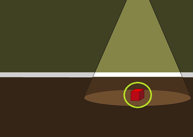
This image is an example of a figurative expression of unity. In this photo it uses circular shapes while having a nice flow through the sculpture.


Wednesday, January 23, 2013

Ideal 2D Design

My Ideal 2 dimensional design has to draw my attention to the image and make me want to look at it. I really like images that are detailed, and symmetrical. Here is an example of an Ideal 2 dimensional design of a logo I created for myself. This logo draws my attention from the outside of the logo to the shapes that create the letters C. L. D. (Christopher Lee Designs).  This isn't what I think every design should be like. I believe that a design should draw the viewers attention in either by the unique design or by use of colors, or both. Also I believe a design can be effective by the way it is layed out.